Are these the most boring album covers of all time...?
7 January 2024, 19:00

Or are they the most stylish? Some artists think less is more when it comes to album cover design. But is it minimalist or simply dull? You decide!
-
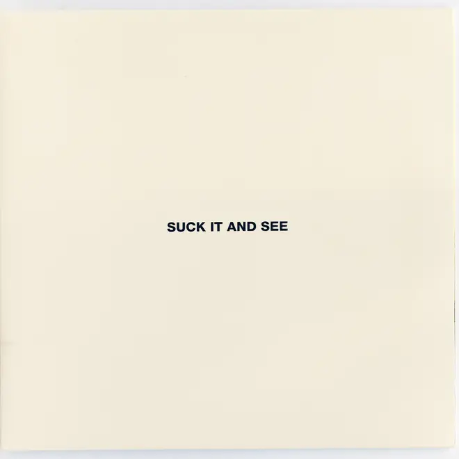
Arctic Monkeys - Suck It And See (2011)
The Monkeys' fourth album was pretty low-key, but the title STILL upset US record stores. Why, for heaven's sake?
Arctic Monkeys - Suck It And See album cover. Picture: Alamy Stock Photo -
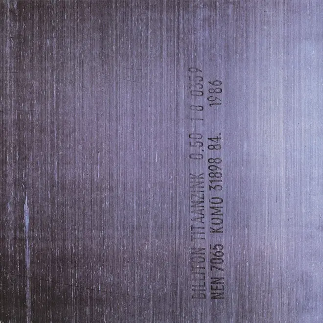
New Order - Brotherhood (1986)
Peter Saville's most wilfully obscure album cover for New Order was the 1986 album Brotherhood, which contained an image of sheet metal and no other markings on the sleeve, apart from the catalogue number FACT 150 on the spine. “Is this the one with Bizarre Love Triangle on?” cried the nation.
New Order - Brotherhood album cover. Picture: Amazon/Press -
Hard-Fi - Once Upon A Time In the West (2007)
For the band's second album, the Staines superstars went minimalist, to "break the rules", according to singer Richard Archer. Designer Peter Saville called it "the White Album of digital culture". Not sure about that one, Peter.
Hard-Fi - Once Upon A Time In the West album cover. Picture: iTunes/Apple Music -
The xx - xx (2009)
The ground-breaking debut album from The xx was also called xx, therefore there was an X on the front and an X on the back of the sleeve. XX, see? Or was it xx?
The xx - xx album cover. Picture: iTunes/Apple Music -
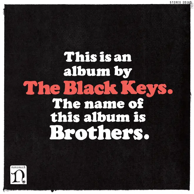
The Black Keys - Brothers (2010)
The Keys got very self-explanatory for their sixth studio album. It was called Brothers, as you may have noticed.
The Black Keys - Brothers album cover. Picture: iTunes/Apple Music -
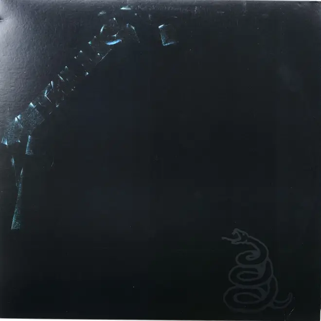
Metallica - Metallica (1991)
Maybe it was a tribute to Spinal Tap, maybe Metallica have no sense of irony, but their classic 1991 LP was pure black (apart from a very, very faint logo).
Metallica - Metallica album cover. Picture: Alamy Stock Photo -
Spinal Tap - This Is Spinal Tap (1984)
In the classic spoof docu-drama, Britain's greatest heavy metal band wanted to issue their Smell The Glove album with a sexist photo on the cover. The record company said no to this, so the compromise was a tribute to The Beatles and the soundtrack album followed suit. How much black could it get? None more black.
The "none more black" cover of This Is Spinal Tap aka Smell The Glove. Picture: iTunes/Apple Music -
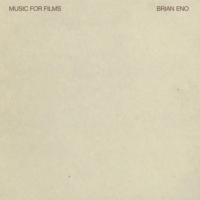
Brian Eno - Music For Films (1978)
Eno invented "ambient music" in the mid 1970s and the low-key music was accompanied by some low-key album sleeves.
Brian Eno - Music For Films album cover. Picture: iTunes/Apple Music -
Public Image Ltd - Album (1986)
John Lydon got down to basics for his 1986 album with PiL. The cassette version was called "cassette", the CD "compact disc"... right down to promotional badges that said "badge".
Public Image Ltd - Album cover. Picture: iTunes/Apple Music -
Kanye West - Yeezus (2013)
Kanye's 2013 album caused a stir with its virtually non-existent sleeve art. Lots of people compared it to some of Peter Saville's designs for New Order. However, we think it's more reminiscent of...
Kanye West - Yeezus album cover. Picture: iTunes/Apple Music -
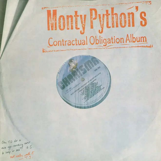
Monty Python's Contractual Obligation Album (1980)
...Python's 1980 album, which was packaged to look like a bootleg. There was also a cassette version along similar lines.
Monty Python's Contractual Obligation Album cover. Picture: iTunes/Apple Music -
The Beatles - The Beatles (aka The White Album) (1968)
The Fab Four did it first, of course. As an antidote to all the extravagant (and horrible) rip offs of the celebrated Sgt Pepper sleeve artwork, Paul McCartney decided that the band's next album should feature something completely different. Most commentators though that the empty white sleeve, with an embossed title and an ironic "limited edition" number was the work of Yoko Ono, but was actually designed by "pop" artist Richard Hamilton.
The Beatles - The Beatles white album cover. Picture: TheBeatles.com -
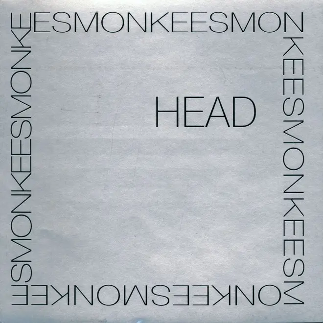
The Monkees - Head
A typical Monkees album cover would feature a glossy colour portrait of the four musicians in question - a crowd-pleasing, accessible piece of promotional. For the band's perplexing feature film soundtrack, the original sleeve was clad in a material that gave the LP a mirrored effect, meaning you could hold up the record and see your own "head" reflected on the cover. This, plus the plain text, was as impenetrable to fans as the surreal and often bewildering movie.
The Monkees - Head album cover. Picture: iTunes/Apple Music -
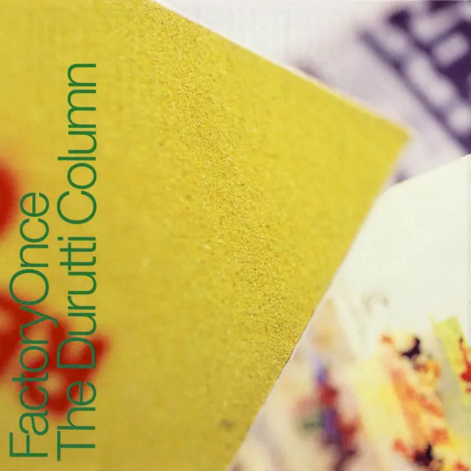
Durutti Column - The Return Of The Durutti Column (1980)
More Factory Records LOLZ - for Vini Reilly's debut album, the label decided to attach an actual piece of sandpaper to the front cover. The rather punk rock idea was that it would destroy other records in your collection. The sandpaper was glued to the sleeves by various members of Factory bands, including Ian Curtis of Joy Division.
The slightly more user-friendly edition of The Return Of The Durutti Column on CD. The sandpaper is still featured. Picture: iTunes/Apple Music -
Autechre - Tri Repetae (1995)
The electronica duo loved an obscure sleeve and this is the MOST obscure - a muddy brown colour, for their third album in 1995.
Autechre - Tri Repetae album cover. Picture: iTunes/Apple Music


