Why the sleeve to Closer by Joy Division was controversial
18 July 2024, 12:00


Who exactly are the mysterious figures on the cover of Joy Division’s final album? And why did the image prompt accusations of "bad taste"?
Listen to this article
Loading audio...
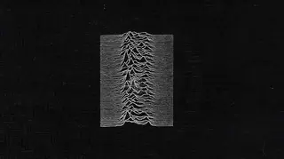
Joy Division’s classic debut Unknown Pleasures features a sleeve design that spawned hundreds of pieces of merchandise and many more parodies. But what about their second album, Closer? What’s that one all about?
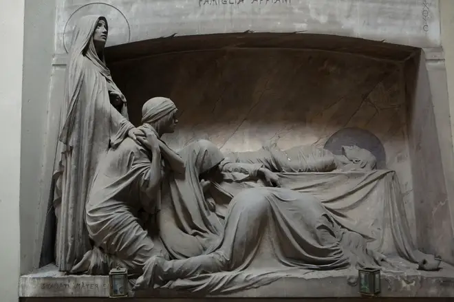
Dressed in sober black and white, the cover artwork features the title of the album written in a font that looks like it’s been chiselled into marble, while a monochrome photograph appears to show four cowled figures grieving around a man lying on a bed.

Released in July 1980, Closer was a posthumous work. Lead singer Ian Curtis had killed himself at his home in Macclesfield, Cheshire on 18 May and the band were no more - they’d agreed yers before that if any one member should leave the group, the Joy Division name should be retired. And that’s how it was, the three surviving members - guitarist Bernard Sumner, bassist Peter Hook and drummer Stephen Morris - would become New Order, alongside keyboard player Gillian Gilbert.
Because Joy Division had an album cover showing a group mourning a dead associate, Factory were accused of poor judgement by some Joy Division followers, who were shocked when they saw the sleeve in the shops for the first time - the cover was literally a wake for the departed singer.
As Morris recalled in his autobiography Record Play Pause, "The photograph seemed either like an eerie prophecy or some bad taste, cash-in joke. Who in their right mind would put a tomb on the front of an album by a band whose singer had just died?"
"We were accused of cashing in on [Ian's] death," said Sumner in his book Chapter And Verse. "As if we would ever do anything like that. It tells you more about the people making the accusations than the band."
In his review of Closer for the newspaper Sounds, writer Dave McCullough noted that the music was "the aural equivalent of a rich marble slab, as luxurious and as poignant as the stoney antique death image that adorns the sleeve".
But any accusations of Joy Division glorifying their singer's death were unjustified.

The album artwork had been created and approved by the band weeks before Curtis died. It was only Factory’s shambolic release schedule that delayed the record getting to the shops - by that point, the tragedy had occurred. "It'd been a good idea at the time," recalls Steve Morris, "but, after Ian died, it became yet another of those awful coincidences."
But what was the cover showing, exactly? It appears to be an image of what’s known in religious art as “The Lamentation of Christ” - the prone figure is Jesus after he has been taken down from the cross (you can tell by the halo) and the other figures are people who were present at the crucifixion. These variously included the Three Marys - the mother of Jesus, Mary Magadelene and Mary of Clopas - and even John the Apostle, Joseph and Nicodemus, depending on which version you look at.
Peter Saville, the designer who had worked with Joy Division on the cover of Unknown Pleasures, revealed that the photos came from a very trendy art magazine called Zoom that had been lying around his studio in London.
He later told Mojo magazine: “Bernard Pierre Wolff had done a series of photographs in a cemetery in Italy. I don’t know to this day whether they were real or not - some of them you thought, he’s set that up - that’s just models, covered in dust.”
Well, the image wasn’t staged, it was in fact a beautifully carved tombstone, situated in the Staglieno cemetery in Genova, Northern Italy. The tomb belongs to the Appiani family and the incredible marble work was created by sculptor Demetrio Paernio in 1910.

Saville explained that Joy Division manager Rob Gretton brought the band to see him to discuss the artwork while they were making the LP: "I hadn’t heard anything they’d recorded so I said ‘I’ll show you what I’ve seen recently that has thrilled me’." He then showed the band the spread of photos by Wolff that covered several pages in the magazine: “I thought the band would laugh, but they were enthralled. They said ‘We’ - that’s ‘we’ - ‘like that one’.
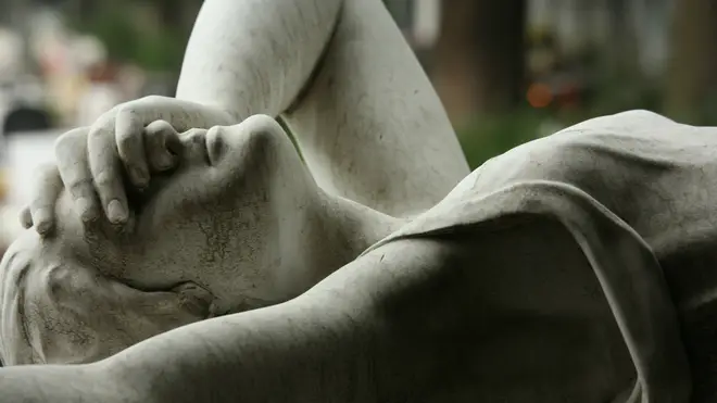
The image made the cover, together with a font chosen by Saville, a simple white border and was printed on soft white card, “like paper used in engraving”, as the designer said. Another photo from the magazine, of a grieving angel sculpture in the same cemetery, was included on the sleeve of the 12” edition of Love Will Tear Us Apart.
The 7" of the single featured the title of the song stamped into a sheet of metal - which looked like nothing less than a gravestone - although it was in fact based on a metal design submitted by Savlle's associate Ben Kelly for his Master's degree at the Royal College Of Art in 1974

After the death of Ian Curtis, Saville suddenly realised the implications: “Tony Wilson broke the news to me and I said, ‘We have a problem. The album cover has a tomb on it’.
“But the band said, ‘We decided it together, Ian chose it.’ The unsettling thing is wondering what was in his mind. I showed them photographs of a cemetery, while the quite writer was penning the closest thing to a suicide note you can possibly get.”
Joy Division fans still make the trip to Genoa to see the sculptures and the excellent Joy Division Central has directions to find the locations exactly.